Monday, December 23, 2013

Texas Flood: Modeling the Colorado River in Texas

Central Texas, including the Austin area where I live, is in the midst of a multi-year severe drought.  Walking around town it's easy to forget this, especially after the city gets some rain and lawns turn green again.  But even with the recent rains, the Highland Lakes, our region's freshwater reservoirs, are only at 38% of their storage capacity.  Lake Travis, located just outside Austin, is currently 53 feet below full.  To add some meaning to those numbers, here are a few pictures.

Lake Travis down 52 feet in 2011
(Photos Credit: Tom Montemayor)
Lake Travis almost full in 2010


Lake Travis shoreline down 52 feet


Lake Travis is a manmade lake, fed by the Colorado River (not the one that runs through the Grand Canyon, this one).  In addition to being a great place to spend a hot Texas summer day, Lake Travis provides all the drinking and irrigation water for the city of Austin and much of central Texas.  So when lake levels get low, people start getting nervous.

It's been a while since I've seen the lake full, so I started wondering what it would take to fill the lake up to normal levels.  Obviously it's not just a matter of getting rain, we need rain to fall in the watershed of Lake Travis in order to capture it.  This is why, despite the wetter than average Fall and Winter we've had in Austin, Lake Travis hasn't seen a significant rise in water level.  All that rain is falling downstream of the lake, and (unfortunately) flowing out to the Gulf of Mexico uncaptured.

To better study the lake, and the Colorado River that feeds it, I went in search of historical data I could use to train a model of the Colorado River.  What I found was probably overkill for the job: historical lake elevations in 15-minute intervals, flow rates from USGS gauges in every stream and river in the American Southwest (also in 15-minute intervals), and daily rainfall totals from NOAA across much of Texas.  I then set about cleaning up the data to get it into a more manageable format.  Focusing only on a period from January 1, 2011 to December 31, 2012, I calculated daily averages for Lake Travis and trimmed the weather data to include only stations located in the Colorado River basin.  The real pain came from the USGS stream flows data.

The file containing the data had about 30 million records, and was over 1 GB in size.  While this is kind of big, it's not prohibitively so.  I probably could have written something to scan the file sequentially and ran in on my laptop without too much trouble, but I wanted to try something clever.  I've written about Pig--the Hadoop-based programming tool that lets you easily parallelize map-reduce-style jobs--before, and I have been looking for a project that's big enough to use it again.  Pig is one of the tools used by real data scientists to analyze very large datasets (think TB and even PB), so I set out to use it to clean up my meager 1 GB file.  I spun up a cluster of 10 machines running Hadoop using Amazon Web Services and ran the Pig script I developed.  The script selects only those sites located in the Colorado River basin, and computes a daily average from their 15-minute interval measurements.  The great thing about Pig is that if I somehow found myself with 1,000 times more data in the future, I could re-run the script again without changing a thing; I'd only need to request more CPU time.

With my data cleaned and scrubbed, I was ready to re-cast my problem into the language of machine learning.  What I had were training data, and I wanted to train a model on the Colorado River basin in order to predict the outcome of future rainfall on the lake levels.  This post will deal with the model training, and in a future one I'll show what would happen if central Texas was hit by a major tropical storm--a scenario many people claim we need if we want to get Lake Travis back to full.

A flowchart describing my model of Lake Travis and the Colorado River
The flowchart above shows the pipeline I used.  First, I used historical rainfall rates to predict the measured flow rates in the USGS data.  Then, I used the flow rates to predict the elevation of Lake Travis.  My reasoning was that stream flows would be the best predictor of lake levels, but if I'm going to run a scenario with a hypothetical tropical storm, I'm not going to have stream flows to rely on.  So I also needed a way to predict the stream flow rates from rainfall data (which I could easily make up for my test).  At each of the two prediction stages, I used a random forest to train my model (more on that later).  However, before I could run anything I needed to better organize my training data into features and examples.

In the parlance of machine learning, "features" are equivalent to dependent variables--in my case these are the different stations recording rainfall or stream flows.  The term "examples" refers to the number of different observations--in my case this would be each day's observations.  The challenge of the model is then to learn a way to map the training set's features to the observations.  So I arranged my training data in the standard way:

The matrix X has columns which are the features of the training data (i.e. flow rates) and each row is an example.  Y contains the target variables that I wish to predict from X's features (i.e. lake elevation).  Each example (row) in X corresponds to a prediction in Y.

I treated each day's observations as an example, with the idea that I would train the model and then feed it new flow rates (which I would simulate from a tropical storm) and calculate Lake Travis's elevation that day.  However, it immediately became obvious that there needed to be a time delay.  The Colorado River is over 800 miles long so it will take water an unknown length of time to propagate down the river.  Flow rates of streams near its source in New Mexico will not be reflected in Lake Travis's elevation for the same day.  So I added a time delay to the matrix X:

Here I added the flow rate for each station up to p days earlier as additional features.

Each station's daily value would still be a feature, but I also added the station's values during the previous p days.  Even if different parts of the river experience different delays, the model will be able to pick the appropriate feature to fit to (i.e. it will find the right delay for each station).   In my final model, I set p to 5.  Of course, I tested to ensure the results don't depend on p--the maximum delay built in.

Now I was finally ready to run the models.  I used the randomForestRegressor model from the scikits-learn package in Python.  A random forest is collection of decision trees that attempt to fit the data by developing rules for how the training examples map to observations of the target values.  There are very sophisticated algorithms for creating the set of rules that performs the mapping.  I won't go into detail here, but random forests create many decision trees using bootstrap-resampled data and then use a majority vote amongst the trees to determine the optimal set of rules for the mapping.  

Here's my program that implements this modeling procedure.  I ran it and found I was able to predict the lake's level pretty accurately from the stream flow data alone:

Source Code My model is able to fairly accurately predict the elevation of Lake Travis from historical data of the Colorado River and its tributaries.  I'm a bit concerned about those spikes where the model sometimes disagrees by 5 feet or so for a short time period, but I'll worry more about that when I'm trying to predict future levels.

This means I have an accurate model of the Colorado River basin.  However, a good model also needs to be able to generalize well to fit new examples it hasn't seen before (called the test set).  This will become very important in the future when I want to predict future lake levels from a hypothetical storm.  However, for the moment I'm not as concerned about overfitting since I'm really only focusing on the training data.  For now, I really just want to know where rain needs to fall to get into the lake.  As I'll show, the model makes intuitive sense to me so for now I'll trust it isn't overly complex.

So now let's try to answer the question of which streams influence the lake level most significantly.  A great side benefit of using random forest models is that they also give some information about the relative importance of each feature to the fit of the model:
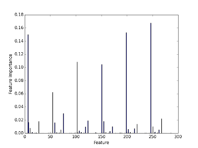
Source Code Here are the importances of each stream in the determination of Lake Travis's elevation.  Clearly there are a few cases that are very important in determining the final prediction.

I can select the top k most important features and examine them.  This tells me about the streams (with their built-in time delays) that most significantly impact the water level in Lake Travis.

Source Code The top 10 most important features (stream gauges) in determining Lake Travis's elevation.

I can put these stations on a map of the basin and show the locations of the important streams and minor rivers that have the most impact on the level of Lake Travis.  When it rains near these streams, the lake rises significantly in the following 1-10 days.

Source Code Map of the rivers and streams that most significantly influence water levels in Lake Travis.

Looking at the map, I feel pretty good about the model.  I've heard weathermen say that we need rain in the Hill Country west of Austin so that the Pedernales River will fill up and bring water into Lake Travis.  Likewise, the San Saba River and Concho River are also major known tributaries to the Colorado.  However, there is one puzzling fact that stands out: 5/9 of the stations plotted are downstream of the lake!  Clearly high flow rates in these streams can't cause Lake Travis to rise.  I think this is a classic correlation vs. causation issue.  I was interpreting the important features, according to my random forest model, as causal.  This is not necessarily true, and the feature importance algorithm will really only pick out features that correlate strongly with changes to the target observable.  However, intuition suggests that the streams found to be important, that are upstream of the lake, should probably influence Lake Travis in a causal way.  After all, water flows downhill.

So the takeaway is that it probably needs to rain near Johnson City, Menard, San Saba, and Silver for water to get into the lake.  Stay tuned to future posts, where I'll try to use the other part of the modeling to predict stream flow rates and future lake levels from a simulated tropical storm over central Texas.

Monday, November 4, 2013

Hurricane Sandy, One Year Later

It's been a year since Hurricane Sandy hit the east coast, and although it's not talked about as much in the national media, things are still not back to normal.  Being born and raised in New Jersey and now living half a country away in Texas, I wanted to look into how bad things still are.  I visited the beaches of southern New Jersey last summer and everything looked pretty much the way I remembered it, but I know that other areas were much harder hit.

When I was home I was bombarded with these "stronger than the storm" commercials, and I thought it was strange that they seemed to only focus on the Jersey shore's recovery.  I got the impression from people I talked to that the majority of the recovery effort has been focused on New Jersey's moneymaker: its beaches.  While this at first made sense to me, the longer I thought about it the more unfair it seemed.  Many of the shore homes being rebuilt are people's second homes--a luxury item.  Sure it sucks to lose that shore house, but it sucks a lot more to lose your only house.  Anyone in that situation would feel pretty left out of the recovery, especially given how much attention is focused on rebuilding the shore.

I set out to visualize the damage from Sandy as well as the recovery.  I wanted to know if there was an income gap in the recovery, and whether there was a bias towards rebuilding the shore at the expense of inland areas.  It turns out, this was harder than I thought.

I started with housing assistance data from FEMA.  Here they break the total housing damage down by zip code and also list the amount of FEMA aid given.  Datasets are split among homeowners and renters.  Since the total damage is not listed for renters, I decided to base my analysis on the homeowners data.  This will skew my results towards higher-income families though, since most low-income families rent.

I wrote a Python script to parse this file and extract some values for analysis.  I initially set out to make maps by writing directly to a blank image of the state with its zip codes identified.  To do this, I used the Beautiful Soup package to parse the XML in a similar way to what I did in my first post.  However, I soon found that this was ugly and uninformative.  I needed to overplot my results onto a real map with cities listed so that people could identify where the damage is.  I looked all over for a Pythonic way to do this, but I never found anything as good as ggmap in R.  The only problem is that I don't know R very well.  My solution: do everything in Python and only write out what needs to be plotted in R!  I did the analysis, set the scale for the fill color, and created a mapping from zip code to fill color all in Python, then just dumped this out to be read by my R script.

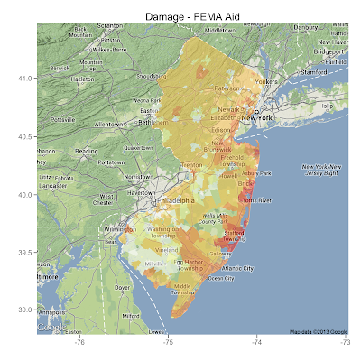
Here's the first map, a map of total homeowner damage in the state.

source: Python R
As expected, the worst of the damage is near the coastal regions.  Also, the damage at the beaches north of Atlantic City was much worse than at the southern beaches I visited this summer.  That part makes sense too.

Now here's a plot of total damage minus the amount of FEMA housing aid.

source: Python R

That plot doesn't look too much different from the first.  The color overlay is lighter in South Jersey, indicating that much of the area has at least received the money to cover rebuilding costs.  Again, when I visited my parents near Philadelphia, that was pretty much the picture that I saw.

I also found data from the office of the Comptroller, compiling all the Sandy-related contracts awarded for recovery.  I can sum these up and subtract from the total damage to get another estimate for how recovery is going.

source: Python R

Again, it's the coast that still has the largest deficit between recovery assistance authorized and damage done.  Clearly these data are telling me that my initial understanding of the situation was wrong.  The state is right to spend more money on rebuilding the shore because that's where most of the damage was.

However, there's a flaw in this analysis.  I'm still only analyzing the housing damage reported by homeowners.  I'm missing a large group of the state's population, and probably those with the lowest income who were financially hit the hardest.  I've tried to account for this by scaling the damage by the mean income for each zip code in the FEMA claims, but this number is self-reported and not properly normalized by household.  The resulting maps didn't look much like anything so I dropped it.  In the end, I guess I learned that coastal storms do more damage to coastal populations.  Wow.  What a breakthrough.

Wednesday, September 25, 2013

(More) Fun with Congressional District Maps

My last post looked at the boundaries of Congressional Districts in the US and tried to draw some conclusions about the political motivations behind the drawing of their boundaries.  Specifically, I calculated the ratio of a district's perimeter divided by its area to find geometric oddballs--districts with funny shapes that I interpreted as evidence for gerrymandering.

It turns out I was on the right track, but didn't have things quite right.  A friend pointed out a link to a study that a professional geographer did on the same topic.  His analysis was pretty close to mine, except he used the the ratio of perimeter-squared over area.  This keeps the ratio dimensionless and is the proper way to do it.  My ratio was actually biasing my result towards finding smaller districts (which tend to be in urban areas, which tend to be Democratic, yadda yadda yadda).

So I re-did my calculation and here is the revised histogram using the correct ratio


You can see one or two Republican districts in the tail towards the right, but it's still a lot more blue than red.  A good sign that this is working is that I now have North Carolina's 12th, one of the most obviously gerrymandered cases, as the district with the highest ratio.

Piggybacking off another comment on my last post, I also decided to add a few more dimensions to my data set.  The commenter suggested that the perimeter-to-area alone might be indicative of natural boundaries that occur in urban areas, and not any malicious political intent.  So I decided to add some extra information and see if it makes gerrymandered districts pop out more obviously.

I added two more variables for each district: the margin of victory in the 2012 election, and the fraction of neighboring districts with the same party affiliation.  Remember that "packing" is the strategy of putting all of your opponent's supporters in a single district so that you can win the surrounding districts and come away with a net gain in Congressional seats.  As a result, districts that are examples of packing should have a comfortable margin of victory and should be surrounded by districts under the control of the opposite party.

This seemed like it should be easy, but finding the data and getting it into a neat form for analysis proved more difficult than I expected.  I took the results of the 2012 Congressional elections from the Federal Election Commission.  Unfortunately, their monstrosity of a spreadsheet tallied all the races (primary and general) for every candidate in every wacko third party for every seat.  This took some work to clean up.  After I got it in order, I tallied up the margins of victory for each district on a scale ranging from 0 (a dead heat) to 1 (a blowout with one candidate receiving 0% of the vote).

The next task was to go through each district and calculate the fraction of neighboring districts under the same party's control.  The first step involved finding the neighboring districts.  This took a lot of thinking.  I was going to do this by going through each district and calculating the distance to all the other districts' boundaries but that would have been horrible.  The boundaries are specified in 100 meter intervals, that means the arrays that hold them have hundreds of thousands of points.  If I'm calculating distances, the number of calculations I'd have to do is astronomical: for P points and D districts it would be $O(P^2 D^2)$.  With P around 100,000 and D=435, that number is huge.

Instead of doing things the brute force way, I got creative and realized that neighboring districts would share some of the same points in their coordinates.  If I could convert these coordinate arrays for each district into sets, I could take advantage of Python's blazingly fast set operations.  With a quick one-liner I can find if any two districts share common points (intersect) and the average-case time it takes for this operation is $O(P)$, a big improvement over $O(P^2)$.

Ok, so now that I've calculated everything I need, what do the data look like?  Here is a 3D plot of the perimeter-to-area ratio, margin of victory, and the fraction of neighboring districts under the same party control.  Dots are color coded according to the current controlling party.
3D scatterplot of all 435 Congressional Districts, broken down by perimeter-to-area ratio, margin of victory in the 2012 elections, and the fraction of neighboring districts under the same party's control.  Blue and red map to the current controlling parties in the obvious way.  Source code: district_findneighbors.pyexplore_district.py 

The most interesting cases are those with a large ratio (so they have a funny shape), high margin of victory (so they're primarily a single-party district) and a low fraction of neighboring districts under their party's control (so they're an isolated island).  These guys are prime examples of the "packing" strategy in action!


Gerrymandered districts show up in the lower right here
and the lower left here.
We can set up a rule for whether or not we label a district as gerrymandered.  For anything that lies in the area I've circled, it's a pretty safe bet that it's been gerrymandered.  Once again, the majority of these points are Democratically-controlled districts.  In my opinion, this shows that gerrymandering is indeed being done, and that it's the Republicans doing it now.  That's not to say that Democrats haven't done it in the past (they have).

As a final point, let's beat the dead horse that is North Carolina's 12th District.  This Democratically-controlled district shows up with the highest ratio, one of the largest margins of victory, and exactly ZERO neighboring Democratically-controlled districts.  If I've done nothing else, I've at least shown that politics in North Carolina are messed up.

Here it is, one more time.  The district that's been referred to as "political pornography".


Friday, September 13, 2013

Fun with Congressional District Maps

With Congress's approval rating hovering below 20%, it's safe to say that all sides of the political spectrum are unhappy.  When you consider that the 113th Congress is on pace to pass only 72 bills in its two-year session (compare that to the mere 900 bills passed by the 80th Congress that got it the nickname "the Do Nothing Congress") it's easy to see why.  Add to that the sharp uptick in partisan vitriol, and I think both Democrats and Republicans would agree that our lawmakers are more polarized now than ever.

So if you were to ask a political analyst why things are this way, I'm betting that many of them would suggest the cause, at least in the House of Representatives, is due to Gerrymandering of congressional districts.  The term Gerrymandering refers to the strategy of manipulating the boundaries of voting districts so as to gain an advantage over your opponent.  There are two strategies employed known as "packing" and "cracking".  The goal of packing is to isolate as many of your opponents into a single district, which you will concede, so that you can win a larger number of the surrounding districts.  Cracking does the opposite, it aims to dilute the strength of a district that is controlled by your opponent by mixing in your own supporters.  These two strategies are usually used in concert for the greatest effect.

Packing, in particular, tends to produce districts that elect Representatives with extreme political views.  Since the district is essentially a single-party district there's no challenge in the general election, and hence no incentive to run a moderate candidate.  This, I believe, is one of the more serious problems with our current Congress, and it got me wondering if it can be traced directly to the maps of Congressional districts.

What I needed was a diagnostic of a Gerrymandered district.  They're easy to spot by eye (they look kind of like salamanders, which is what coined the term in the first place) but I had no intention of looking through all 435 Congressional districts for oddities.  I needed an automatic classifier that would be able to separate obviously-gerrymandered districts like North Carolina's 12th:


from districts with relatively normal boundaries like Georgia's 2nd:


I decided to use the ratio of a district's perimeter to its area as a proxy for gerrymandering.  For districts like Georgia's 2nd that are close to rectangular, this number is relatively small.  However, districts like North Carolina's 12th, with all its twists and turns, should have a much larger ratio relative to normal.

So I wrote a script to compute this ratio for every district and make a map of the districts with the largest ratio.  Ok, so how did it do?  The answer is it performed surprisingly well given the very limited input information.

Here are some of the maps I made of districts with the highest ratio of perimeter to area:


Source Code
View Larger
View Larger
View Larger
and here are some districts with a low ratio:
View Larger
View Larger
View Larger
Notice how the obviously gerrymandered districts all occur around urban areas?  That's not by accident, it's a great example of "packing" in action.  After a quick inspection, I'm feeling pretty confident in my perimeter-to-area classifier's ability to pick out gerrymandered districts.  So let's see what else we can learn from this.

Here's a histogram of all the districts' ratios broken down by which party currently has control of the district.  
Every district with a ratio greater than about .0005 is Democratically-controlled.  If my classifier is working, that means that every one of the most gerrymandered districts is a Democratic district.  Doesn't that sound like shenanigans?  Source Code
I found it remarkable that all of the districts in high-ratio tail of the distribution are Democratically-controlled.  This suggests that Republicans are winning the gerrymander battle and successfully concentrating Democrats into "packed" districts.  Maybe that's how, despite winning more votes than Republicans, Democrats currently own a 234-195 minority in the House.  Representative democracy in action!

Tuesday, June 18, 2013

Understanding Aircraft Bird Strikes: (Messing Around with Tableau)

Ok I'll admit it, I'm a bit of a nervous flyer.  I'm the guy on the plane who looks around at all the flight attendants after every little bump or noise to make sure nothing's wrong.  So when a United Airlines 737 was taken down by a flock of geese, that was the last thing I needed to hear about.  I had no idea something as small as a bird could have such an impact on a 30 ton aircraft.

And then there was that episode of Mythbusters where they shot chickens out of a cannon into an old aircraft frame to see the damage.

Even though it turns out they were shooting frozen chickens (they forgot to thaw them), the results were still scary.

So how frequent are bird strikes?  And when do they occur?  I was given a dataset containing information about all the recorded bird strikes over the past 12 years.  The first thing I noticed was that the file was almost 100,00 lines long.  Crap.

Fortunately, out of these 100,000 strikes there were only 107 injuries and 5 fatalities.  Humans seemed to fare much better than the birds.  In order to get the most out of this rich dataset, I used Tableau--a data visualization product that can make some fancy interactive visualizations.

This is what I came up with

To get a full appreciation for the interactive nature of Tableau you have to click the link above.  Here are some highlights.

I had no idea that bird can fly as high as 25,000 feet!  It makes sense that some of the most damaging (costliest) strikes occurred when the plane was traveling fast at a higher altitude.

Texas and California have had the most strikes, but this is a bit misleading.  They are also the most populous states, and have some of the nation's largest airports.  There are many more flights originating in these two states compared to other smaller states.  That means there are many more chances for a strike.

The majority of strikes occur in clear skies during the day.

Monday, June 3, 2013

Analyzing the Semantic Web

As part of an assignment for a class I'm taking on Coursera, I recently played around with a big data set representing the Semantic Web (an attempt to organize the world into a network of data that's capable of  being understood and manipulated without human input).  One of the dreams of this project is to allow machines to interact with the entirety of the world wide web without any direct human input.

The data set that describes the Semantic Web is a classic example of Big Data.  The set I used for my analysis is known as the Billion Triples dataset.  It contains a billion entries in a format known as RDF triples.  This format requires statements to be expressed in the form:

Subject Predicate Object

For example, to say something like "Bob is Tim's father" in RDF you would write

Subject:[Bob] Predicate:[is the father of] Object:[Tim]

In the Semantic Web, the entities in the RDF triples are not confined to only people, but can be anything described by a URI (Universal Resource Identifier)--literally anything.  The Billion Triples database therefore contains a ton of information describing the relationships of interconnected people/places/things/companies.  We can treat this set as a directed graph where each entry represents an edge between two vertices (the subject and object).

An example of a directed graph.  If this were to represent the Semantic Web, each of the circles would be represented by a URI.  The arrows are drawn whenever a subject points to an object in RDF.

Analyzing graphs like this is a standard task for data scientists, and one common quantity to compute is the out-degree of each node.  This represents the number of objects that a given subject links to.  In the example graph above there are 2 arrows leaving node 7.  Therefore node 7 has an out-degree of 2.  We can learn a lot about a graph by computing a histogram of the out-degree of all its nodes.

However, the Billion Triples data set is so large (>0.5 TB) that a single computer can't handle it.  Instead we have to use a cluster of computers, each operating on a small chunk of the data.  This situation refers to a classic computer programming model known as MapReduce in which common tasks get mapped to a single machine which then performs some simple aggregate function (like counting) in the reduce step.

When files are this large, they can't be stored in traditional file systems.  Instead, distributed file systems like Hadoop break up large files into many smaller chunks stored on separate machines across a network.  In this way, file access can be parallelized and you can scale up your MapReduce jobs into the cloud.  This is exactly what I did for my analysis of the Semantic Web.

Using Amazon Web Services, I pulled the data set from S3 storage and analyzed it on their cloud computing servers.  To setup the MapReduce jobs, I used the programming tool Pig.  This tool coordinates the resources of the 20 compute nodes I ran my script on.  In my Pig script I group the entries by subject, then count the number of entries for each subject (the out-degree).  Then I count the number of subjects having out-degree d for my histogram.  After 4 hours of running in the cloud, I get the following plot:

The distribution of subjects having various values for their out-degree.  Fits to the data were obtained with the optimize.curve_fit package in SciPy.


The code I wrote to generate this plot fits an exponential function (blue) and a powerlaw function (red) to the distribution.  A result from graph theory is that the out-degree histogram of a random graph will follow an exponential distribution.  Since the blue line is a terrible fit to the data, we can tell that the Semantic Web is not a random graph. Instead, we can see that a powerlaw with index -2.2 does a pretty good job at fitting most of the data.

This index of -2.2 in a powerlaw distribution is a number that frequently comes up in the analysis of networks.  Researchers studying the patterns of phone calls among AT&T's customers also find the exact same distribution with the exact same index.  There is something fundamental in the way networks organize themselves such that they produce powerlaw histograms with an index near -2.2.  I find it really interesting that a network of telephone calls among friends displays the same properties as a catalog of the relationships between everything in the Semantic Web.  Even more interesting was the cloud computing I got to do (for free with a student grant from AWS, I should add!).

Thursday, May 23, 2013

My First Blog Post: A Look at Severe Weather in the US

Following Monday's devastating tornado in Moore, OK, I've been thinking about all the severe weather that's been in the news.  Whether it's hurricanes in New Jersey or two EF-5 tornados hitting the same town in a 15-year span, it just seems like there's always some natural disaster on TV.

And yeah, if this is starting to sound like crazy talk I feel the same way.  People tend to emphasize recent tragedies and forget about the (equally bad things) that happened in the past.  Plus, I'm pretty sure there's always a group of people who want to think that they're living in the End of Days.  Still, with global temperatures on the rise, there is the possibility that a hotter climate is fueling more severe storms.

So, can we put this to the test?  Have the past few years had abnormally bad weather?  I started trying to answer this question with the NOAA's Storm Prediction Center.  They have archives of all the reported tornados that touched down in the US over the past 60 years.  I wrote a quick web crawler to grab data from two separate time periods: 2000-2004 and 2010-2012.  The 2000-2004 data will serve as a baseline and I will look to see if there are more torandos per year in the 2010-2012 set.  Right off the bat I can tell you that I don't remember any bad tornados from 2000-2004 and I can name at least 2 from the more recent years (Joplin, MO and Tuscaloosa, AL).  Let's see if I'm remembering recent disasters at the expense of older ones. 

Below are two maps I made: the average number of tornados per year over the two time periods.  Results are broken up by state.


These maps were made from the NOAA's Storm Prediction Center Archive
It does appear that there were more tornados in the second period (over 300 more per year).  Also the number of tornados in the so-called "Dixie Alley" (Alabama, Mississippi, and surrounding areas) has risen sharply.   But is any of this significant?  My guess is probably not, although I don't have time to run a significance test on it.  It's possible that the number of storm chasers has gone up from 2000-2012 and more tornados that would have gone unreported are now being documented.

 I also made maps of the strong tornados that occurred during these time periods.  I classified a strong tornado as EF-3 or greater.  These twisters are damaging enough to take the roof off your house at EF-3, but fortunately they are much less common.  The next two maps show the average number of strong tornados per year and you can see that they're much less frequent than their weaker counterparts.


Average number of strong (EF-3 or greater) tornados per year.

Ok, those two maps actually look different!  Indeed, there were over twice as many strong tornados on average in a given year from 2010-2012.  I'm also less tempted to dismiss the differences as due to a recent increase in storm chasers.  My reasoning behind this is that these strong tornados are hard to miss.  I would think it's much easier to miss out on an EF-0 twister in MiddleOfNowhere, Kansas than one of these monsters.  Then again, I'm not a meteorologist, this is just an educated guess.

It's tempting to see this and shout "global warming is killing us all!" as you run back to your underground bunker that was deserted after December 22, 2012.  But keep in mind these are very small numbers being compared over a very short time baseline.  To make a better argument for climate change, I would have to go back and look at historical records from 50 years ago.  Even if I did this, I'd still have to deal with the fact that mobile Doppler radar trucks and cell phone videos weren't around 50 years ago to document every tornado.  I guess I'm stuck, but I did learn a few things (namely how to parse XML with python, and retrieve lots of data with an automated web crawler).  This was kind of fun.